
Click here for a visual summary of the points laid out in this article for those who have less time to read.
–
Companies in the B2B space are serious business. The enterprise world has to focus on proving its security, robustness, reliability, and that it can manage the scale and needs of other enterprise companies.
The problem: Last year, the MarTech Conference reported that there are 3,874 marketing technology companies vying for attention in the crowded B2B marketing space. This is up from 150 in 2011. Enterprise buyers are overwhelmed with options today more than ever.
Given the accelerating fight for attention, it’s important to stand out and show personality, to be bold and stake a claim that resonates and goes straight into the value proposition.
This article aims to give you guidelines in how to stand out with boldness while still balancing the need to be serious, secure, and show clear value and ROI.
The balance lies in being bold with your visuals, your colors and your taglines, but be more conservative and appreciative of standards when it comes to your user experience.
If you can balance these two, while keeping your target personas strongly in mind, you will see a measurable metrics return in your analytics.
In 2017 technology is friendly and playful, not scary or dark.
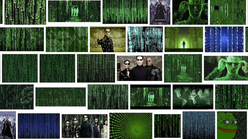
Whereas our old notions of the future used to be like this:

Our new notions of technology are closer to this:
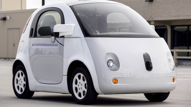
A decade ago, we used to think of technology like this:
But in today’s world, technology looks closer to this:
Major companies like Google and Slack, are choosing light colors and playful illustrations to accompany their message and humanize the technology.
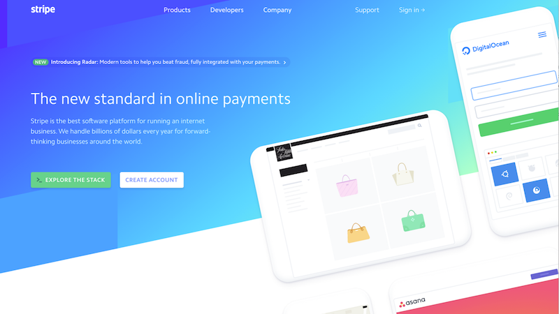
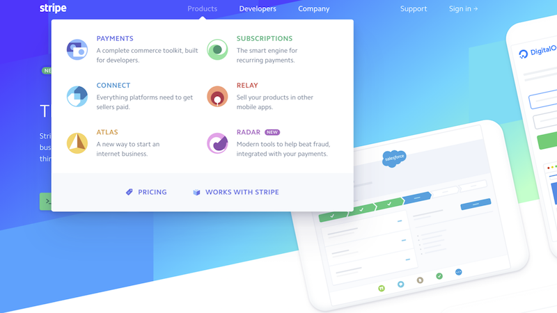
Even in the world of security, payment gateways like Stripe (recently branded in late 2016), are opting for bright colors, in vogue gradients and playful interactions:
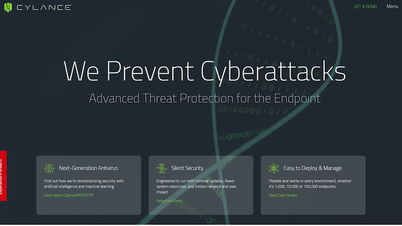
Should a security company in 2017 look like this?
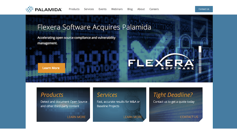
Or this?
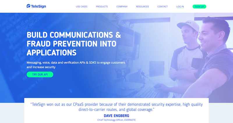
In our recent rebrand of Telesign, a leading fraud prevention and communications platform, we balanced their signature “security” blue with lighter tones, gradients, a new playful typography and illustrated devices.
The result in our user testing was a renewed enthusiasm for the brand, as opposed to a perception that they are somewhat less secure because they got a little friendlier.
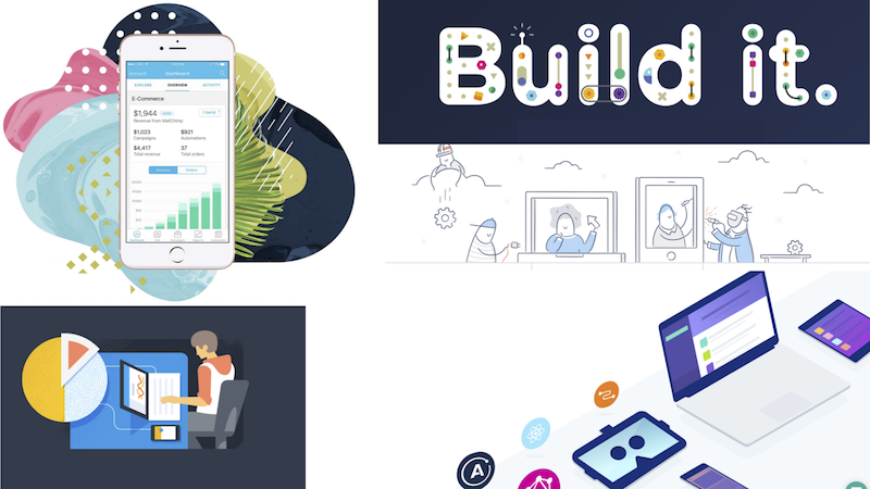
One of our favorite examples that clearly shows the importance of humanizing the technology, is Mixpanel’s latest rebrand:
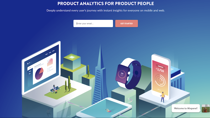
Notice that they created an illustrated universe that isn’t shy of color, with a headline right up front that says “Product Analytics for Product People,” clearly showing it is the human interpreting the data that really matters.
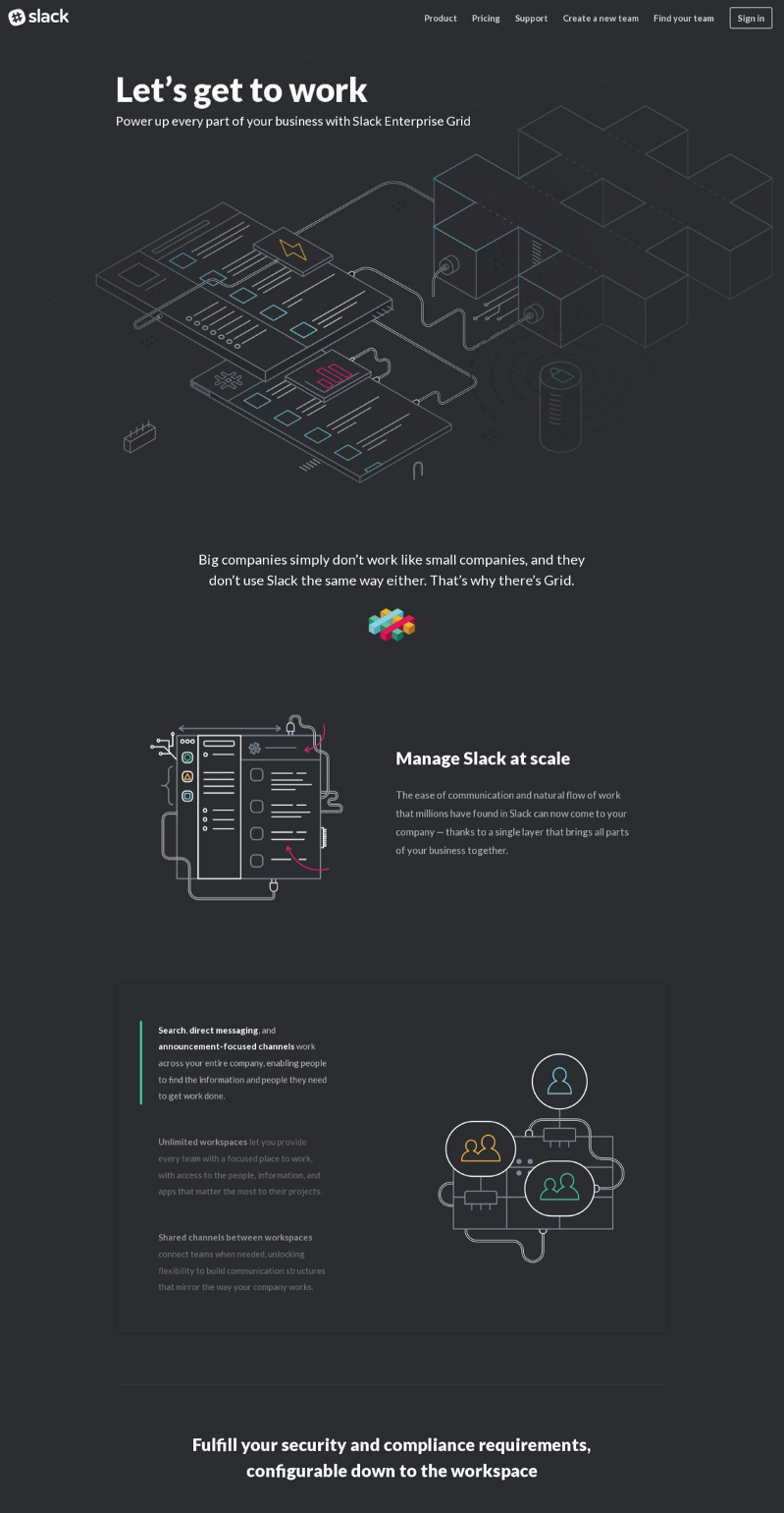
It is the people using the tools that are ultimately going to advocate for them. Slack is a perfect example of this. The company has seen unprecedented viral growth in the enterprise space. A bold brand that stands out from the pack is ultimately what is going to help your users become your biggest advocates and engaged customers.
To summarize:
Too often, bold brands attract clumsy UX. Bold, clean, and contemporary are important design maxims, but UX needs to dictate thorough, clear, and visual explanations. Teams are too often tempted to give up on UX for the sake of minimalism.
In building our website, we debated whether to include a full menu or just use the hamburger menu for the desktop version. In the end, we opted for a hamburger menu beside a contact button.
Two factors helped us make this decision:
To compensate for this choice, we chose to reinforce our main call-to-action (the contact page) with an icon/hover on the nav bar, as well as the closing footer at the end of every page.
This reinforcement for the key action of the site is important for lifting conversion rates.
In the case of Stripe’s new website, they created a clean menu structure that strips away down-arrow menu knick-knacks and allows for flexibility of design in between sections, but still shows all relevant information in a traditional menu structure:
In the case of enterprise web design, we highly recommend that key menu items are placed in a nav bar without use of a hamburger menu. Studies show that desktop users tend to click less on internal pages that are inside a hamburger menu.
Why place key pages of your user journey like Products and Solutions in places where they are less likely to be seen just so that things look “clean”?
The same goes for calls-to-action. Studies even show the importance of using certain colors in calls-to-action yet we see time and time again companies opting for transparent buttons, no buttons at all, or even switching key action messaging for simple icons that bear further clarification.
Other notable and common mistakes is to go so minimal that the website doesn’t tell a story at all, which is the lynchpin of good UX, and rather opts for boxing-in options and links.
This design looks clean but just gives too options upfront making the user journey seem unclear:
The Slack for enterprise site on the other hand is designed to be read like a story.
Again Stripe’s website shows us great design. Their overall layout uses an open canvas that feels open while still allowing for wordy technical explanations where needed.

The point we want to make is this: bold design is not to be equivocated with bad UX. They are to work together.
Good design functions as a whole, for your product, for your communications, for your support documents and for your sales presentations. It works across all mediums and adapts to your moving goals.
At the end of the day you are designing a system, NOT a thing. Be bold.
Want to give your fellow colleagues and stakeholders a nudge to be bolder? Enter your email below to download our eBook, a visual summary of the points laid out in this article for those who have less time to read.